Category
Client
Virsari Shop
Timeframe
6 Weeks
THE CHALLENGE
The primary challenge for the VIRSARI Brand Identity project was to create a distinctive and memorable visual identity that would stand out in the competitive home and lifestyle industry. Virsari needed a brand that could effectively communicate its core values of holistic well-being, innovation, and trustworthiness according to their main target audience. The challenge involved balancing modern design elements with a sense of calm and reliability, ensuring the brand would appeal to a diverse audience while maintaining a cohesive and professional appearance across all touchpoints.
THE SOLUTION
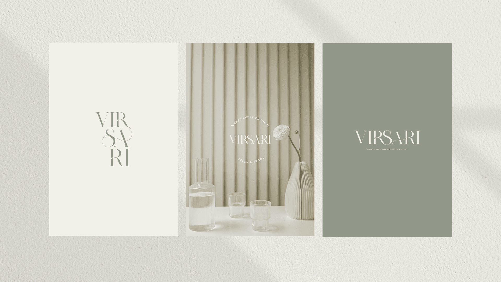
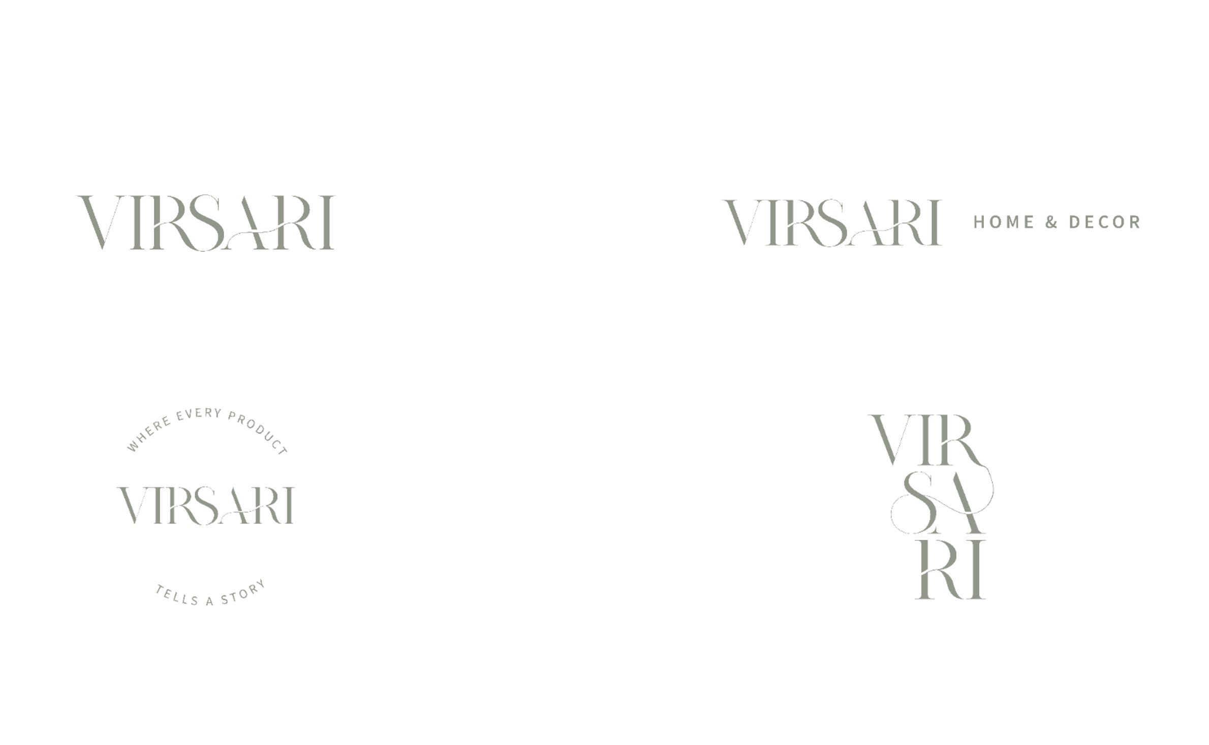
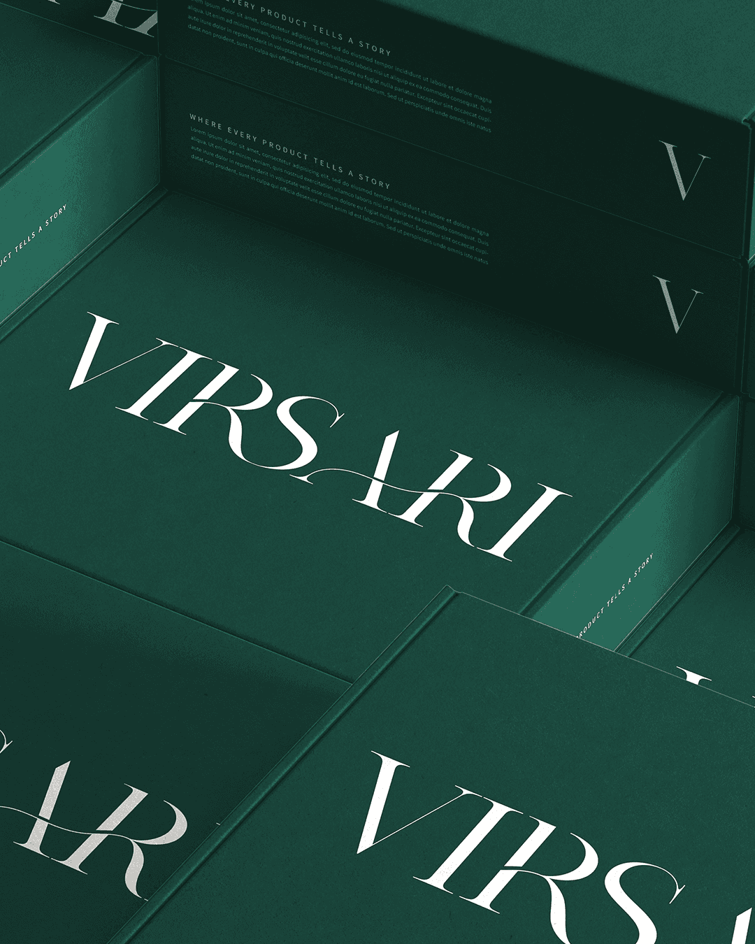
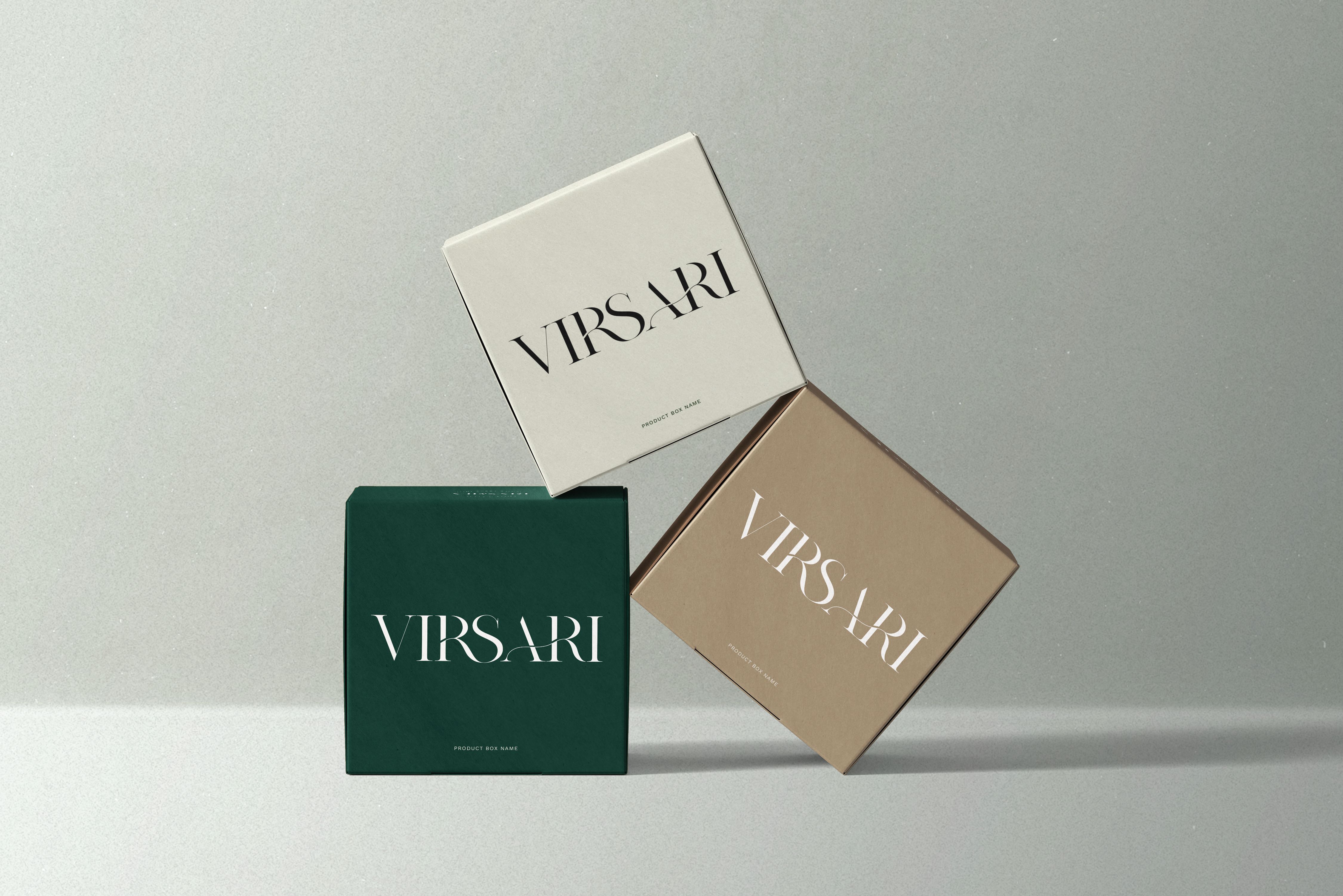
To represent the idea of versatility and sophistication, The Logotype was created, based on a modern serif typography that contrasts between thinner and thicker curves, to represent the vibe of femininity, sophistication and luxury as part of the main brand attributes. The “white space” applied on letters and Ligature detail presented between the letters R, S, A and R was also developed in order to represent the idea of Versatility, as part of the brand name meaning – VIRSARI.
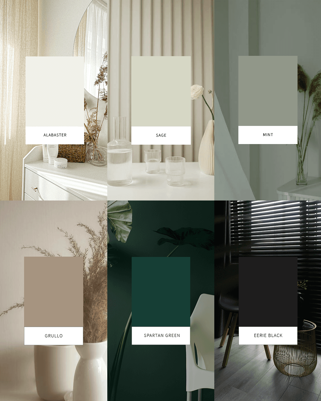
The Color Palette was also carefully chosen based on the attributes given during the strategy session of the project, to represent the idea of neutrality and sophistication to the brand. The Alabaster and Spartan Green colors were chosen as the brand primary colors and which will appear on most of the promotional brand collaterals, together with the secondary colors – Sage, Mint, Grullo and Eerie Black that will bring more flexibility to the brand alongside the primary colors.
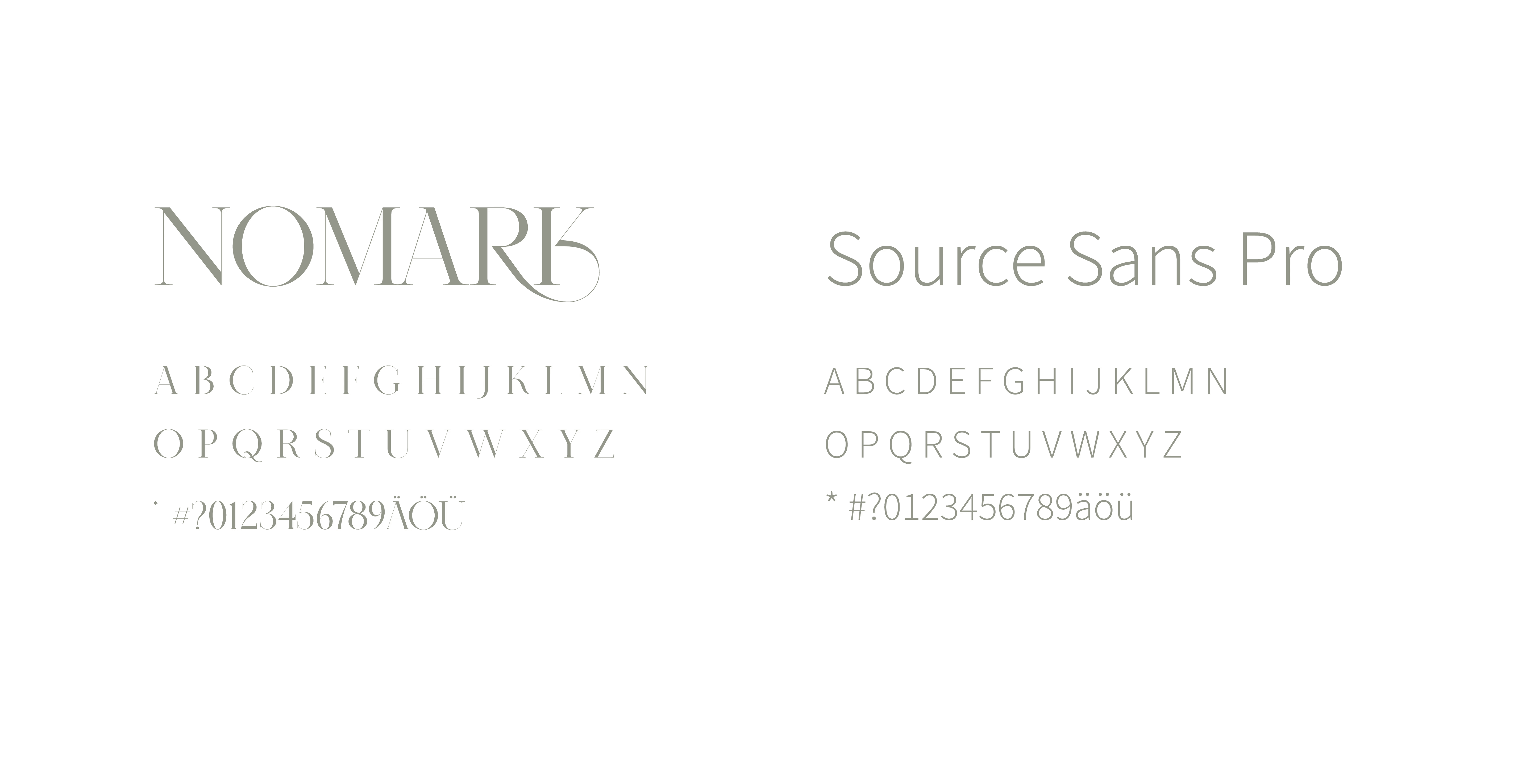
The Typography was also carefully chosen, bringing a pairing between the serif logo font – that brings the sense of luxury, femininity and versatile vibe, and which was chosen to be used as a display font for most of the brand marketing materials, and a sans-serif font – that brings clarity, elegance and simplicity to the brand, chosen to be used in sub-headlines and body copy, offering a wide range of possibilities of application as well.
THE PROCESS
Research & Strategy – I started by analyzing the home and lifestyle industry, identifying key competitors, and defining the brand’s positioning around holistic well-being, innovation, and trustworthiness — all this step was done during a first consulting call and questionnaire with the client.
Concept Development – I explored ways to balance modernity with a calming and sophisticated feel, ensuring the brand appealed to a diverse audience — Everything through a moodboard collaboration with the client and initial workshop to understand about her business and audience in depth.
Logotype Creation – After collecting and studying all the design possibilities through the brand research and moodboard sessions, I finally started to brainstorm ideas, and developed the first sketches of the logo and design a modern serif wordmark with contrasting curves, incorporating ligatures and strategic white space to symbolize versatility as requested and desired by the client. Also considering as many variations of the logo as possible for maximum versatility and application on all the brand products and marketing collaterals.
Color Palette Selection – After analysing and defining the brand style, I carefully curated a neutral yet refined palette featuring colors that ranges from neutral to earthy and bold tones in order to contrast with the elegance, calmness and versatility as keywords previously established for the brand identity.
Typography Curation – Considering the wide range of products and audiences of the brand, I paired an elegant serif font for headlines and display materials with a clean sans-serif font for readability and versatility across brand applications.
Finalization & Brand Guidelines – Finally, with the approval of all the design elements, I started to refine and export all the design materials for delivery and document the entire visual identity system in a comprehensive brand guide, ensuring clarity for all the print & digital applications. After this final identity and guidelines, we could go forward with the rest of the add-ons necessary for the brand's packaging, Amazon ads and other marketing collaterals.
1. LOGO VARIATIONS
2. COLOR PALETTE
3. TYPOGRAPHY
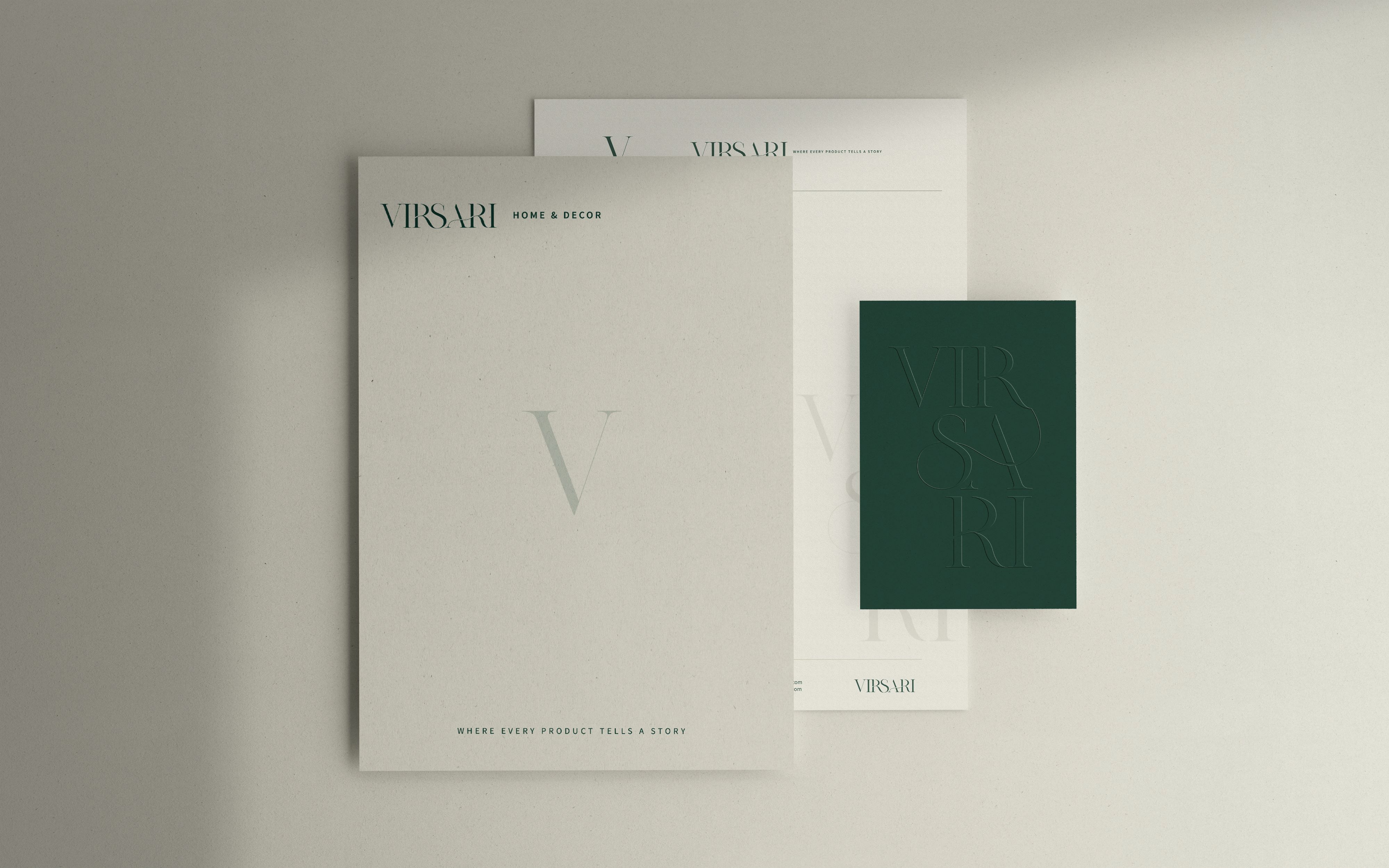
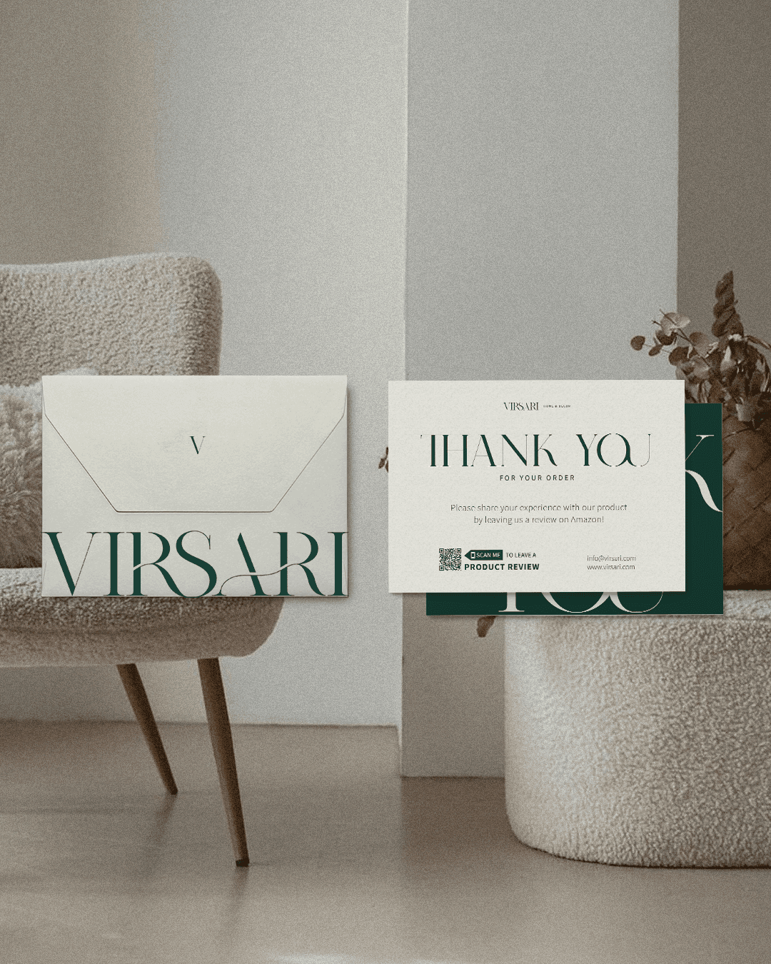
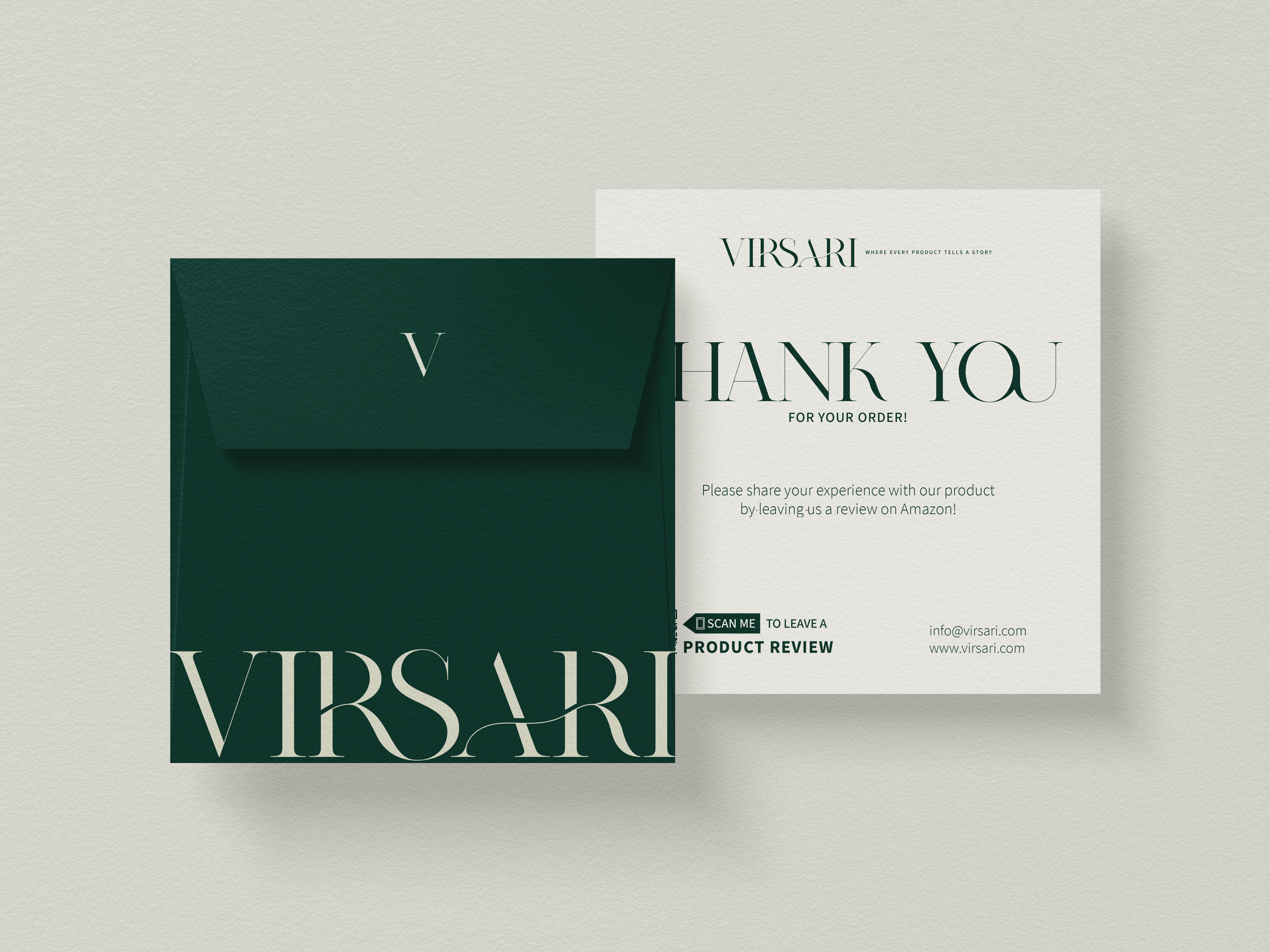
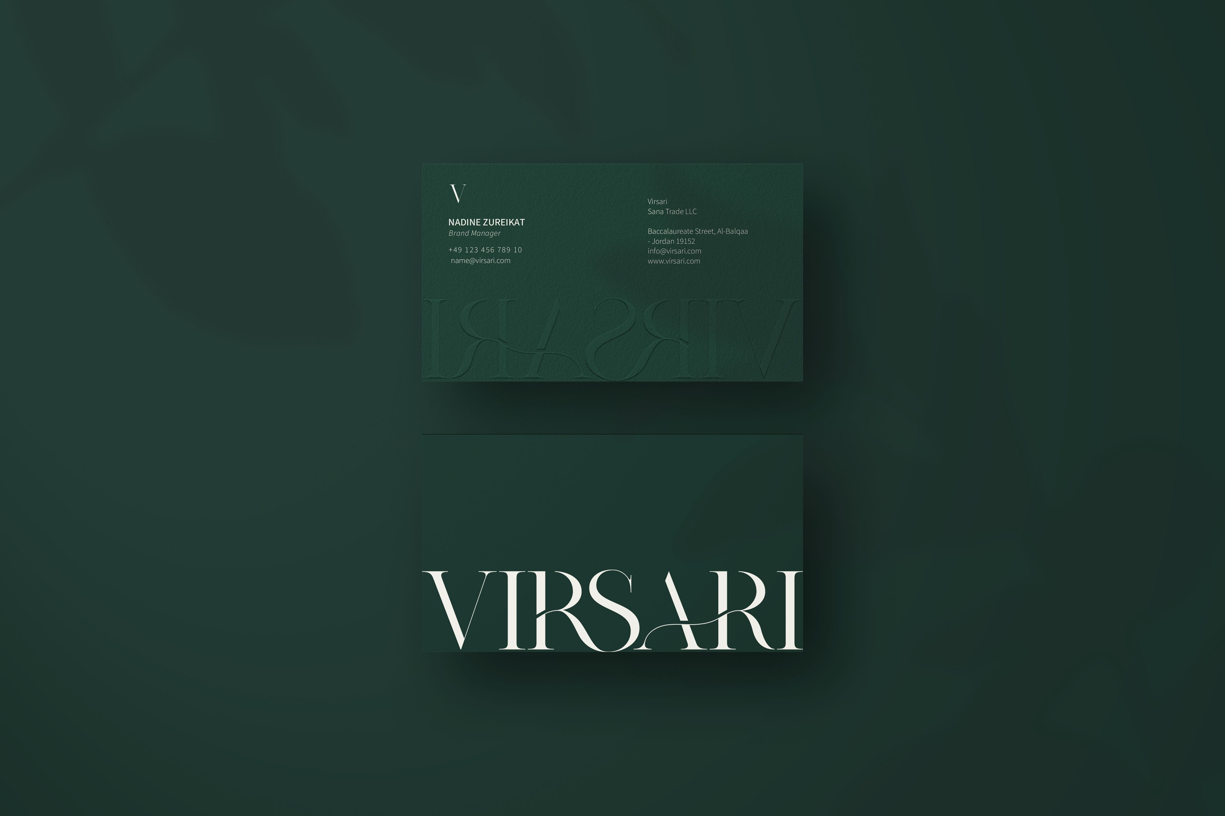
4. BRAND STATIONARY
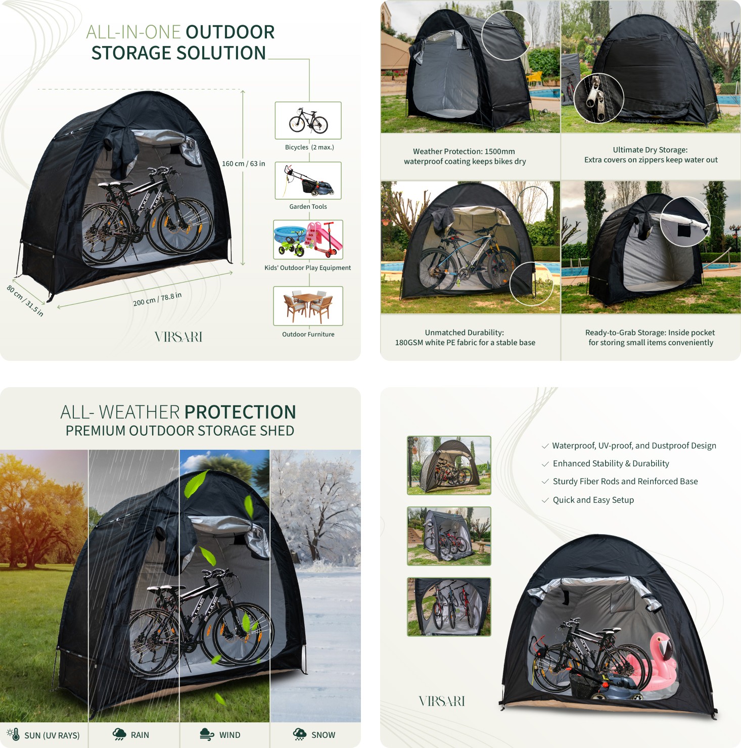
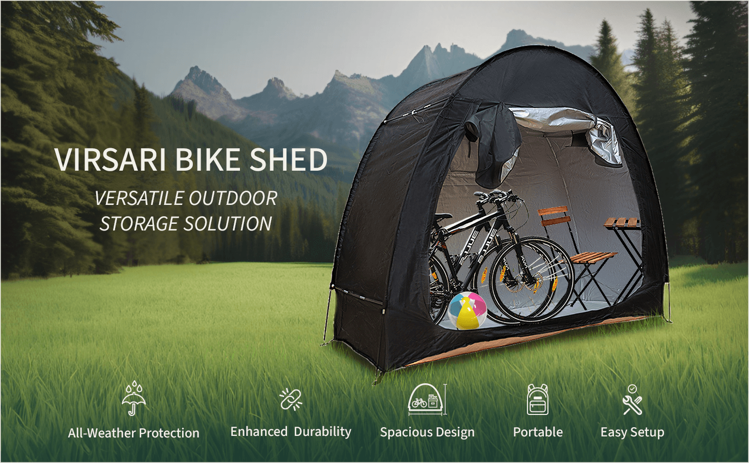
5. AMAZON LISTING AND A+ CONTENT
