Category
Client
NZ Concepts
Timeframe
4 weeks
THE CHALLENGE
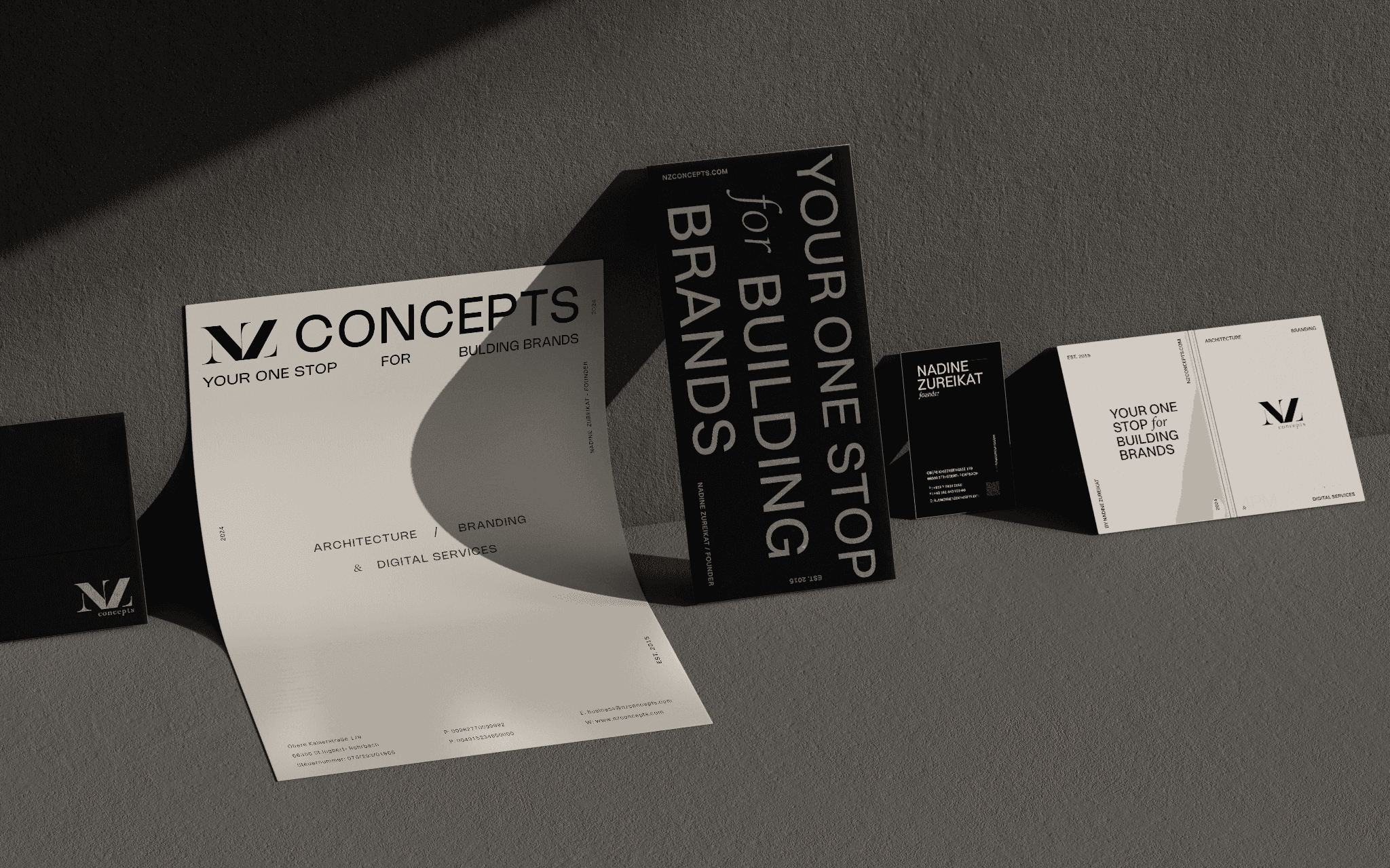
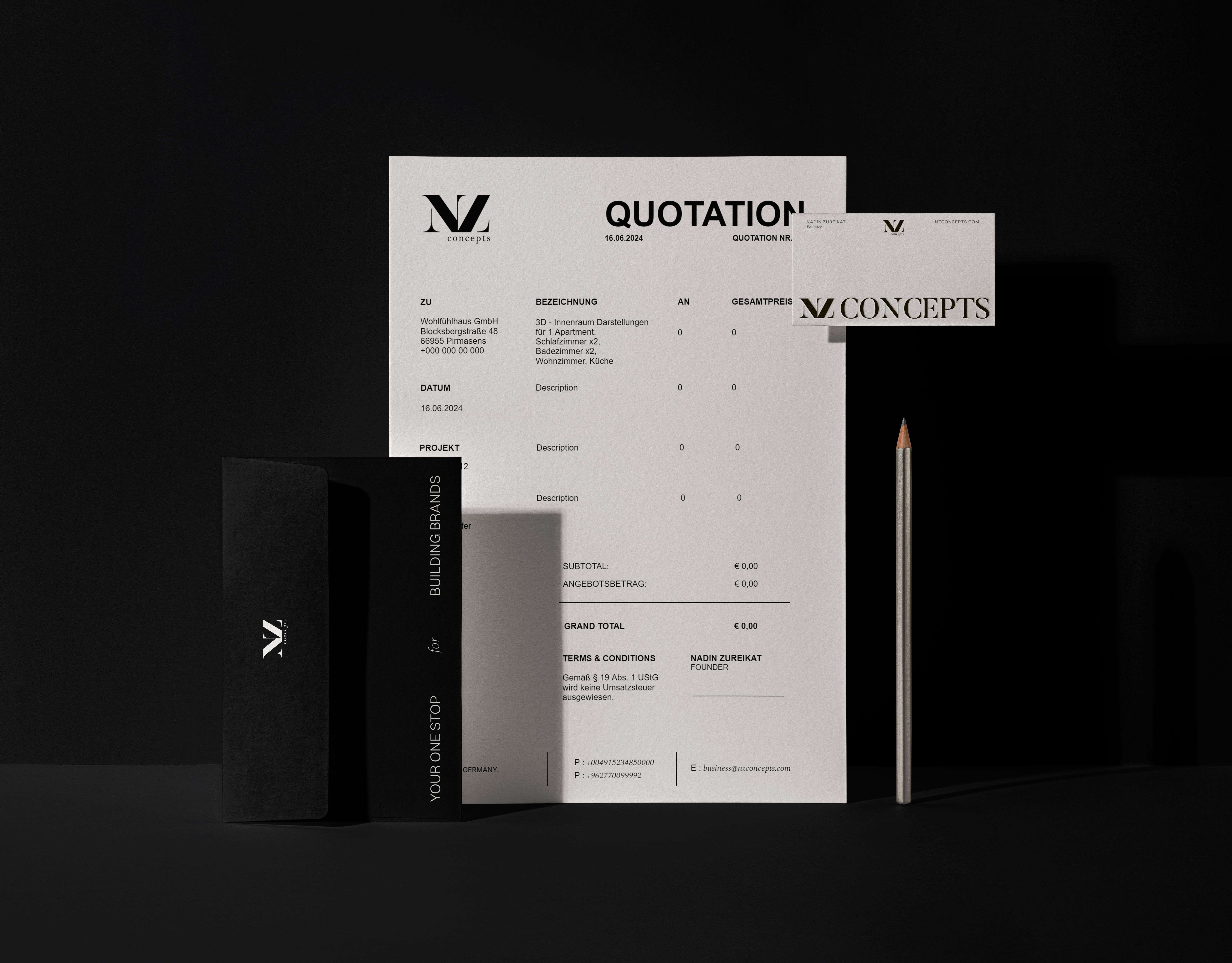
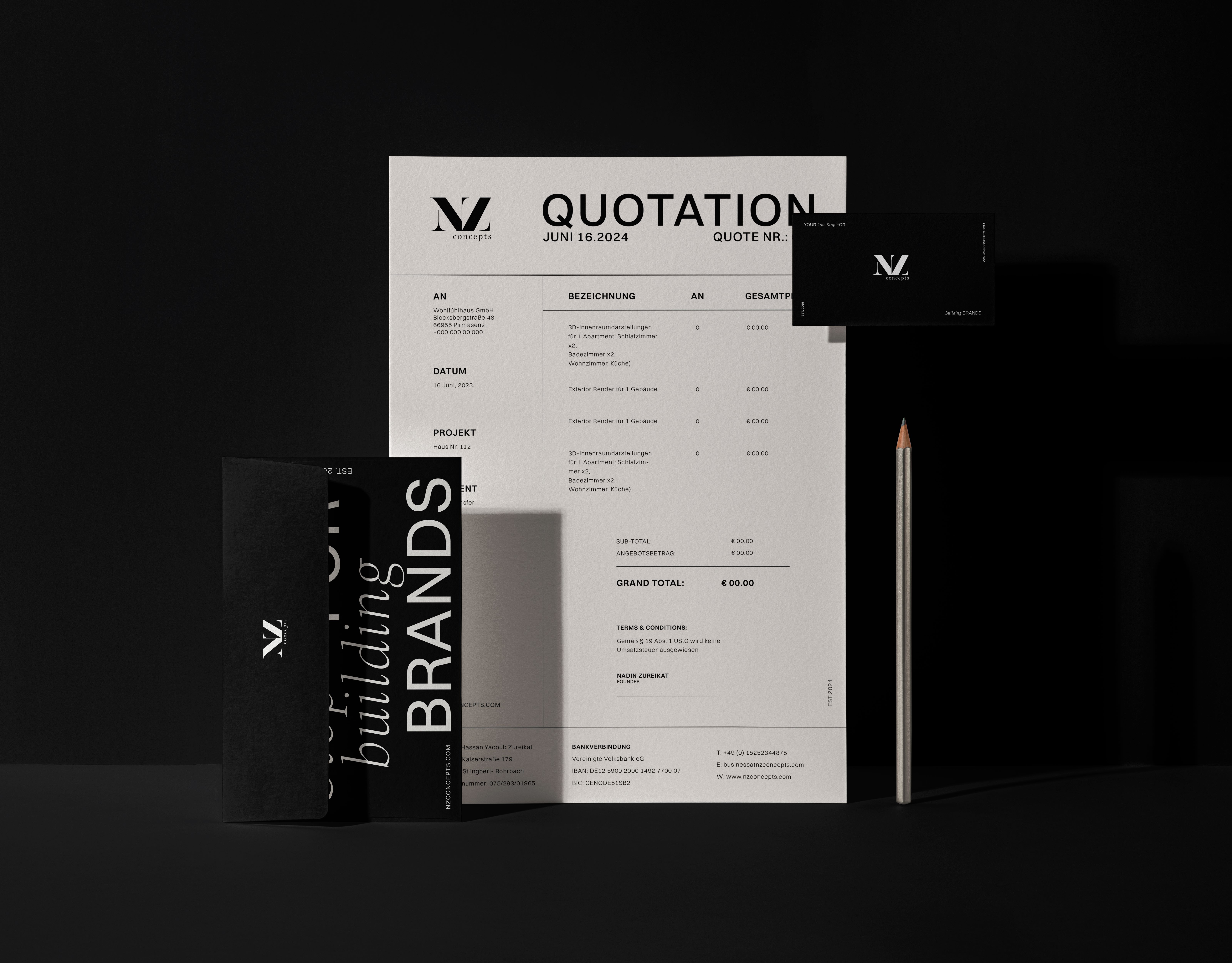
Below you'll see a set of stationary concepts that I created for NZ Concepts marketing agency. The aim purpose of the project was to highlight the agency's branding (who are focused on architecture, branding and digital services) - through a modern, bold and elegant approach (taking inspiration from Swiss-style designs), using of a modern and geometric typography contrasting with an elegant serif-font as main elements of the branding, together with neutral colors such as white, beige and black.
The brand already had their logo and were in the need to redesign their print and promotional presence, with elements that bring the architectural, clean and bold vibes that the brand aims for.
THE SOLUTION
The first design concepts were not chosen by the client in the end, however, I loved the overall look of them and decided to share as a concept work I really enjoyed working with.
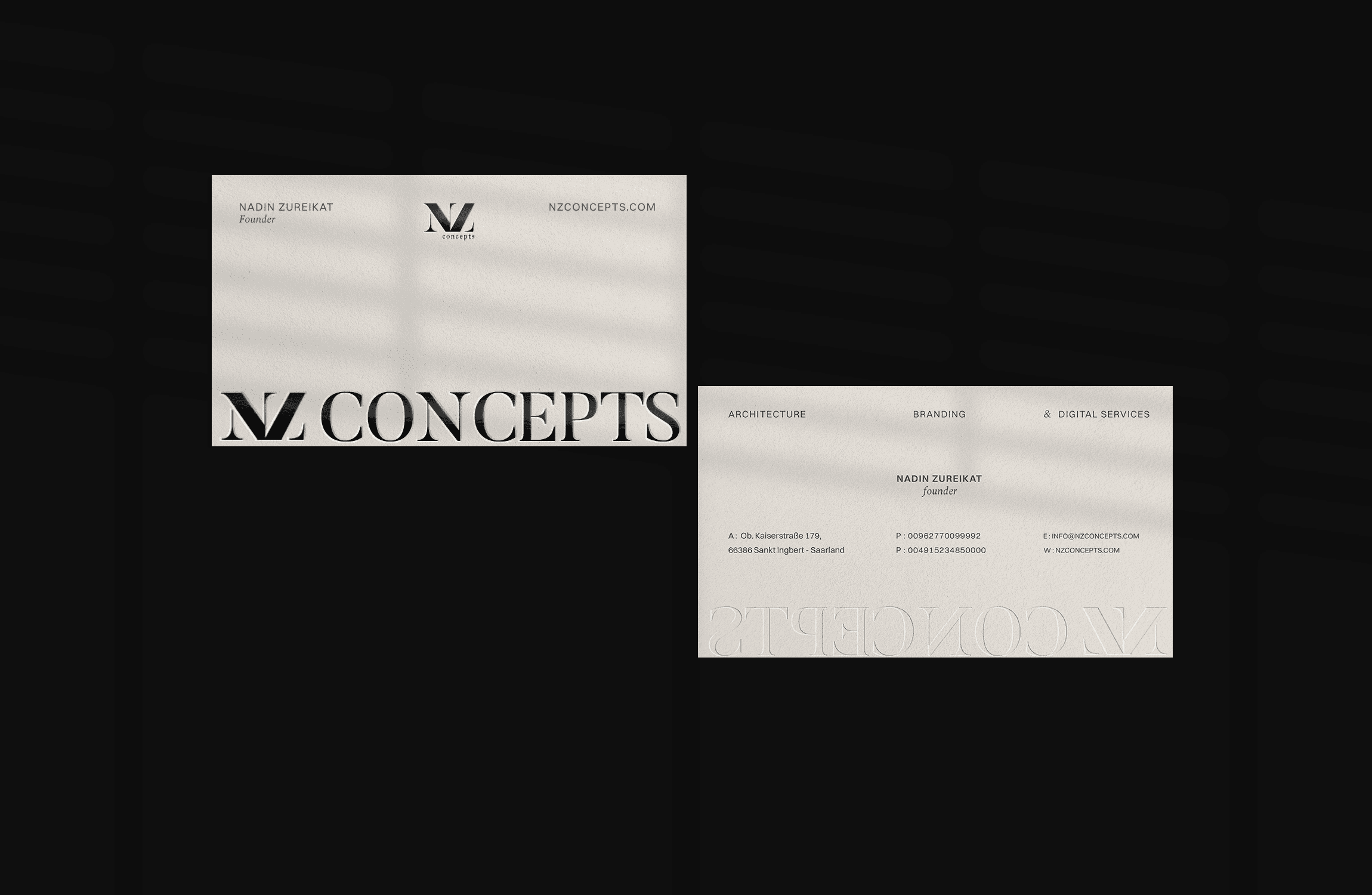
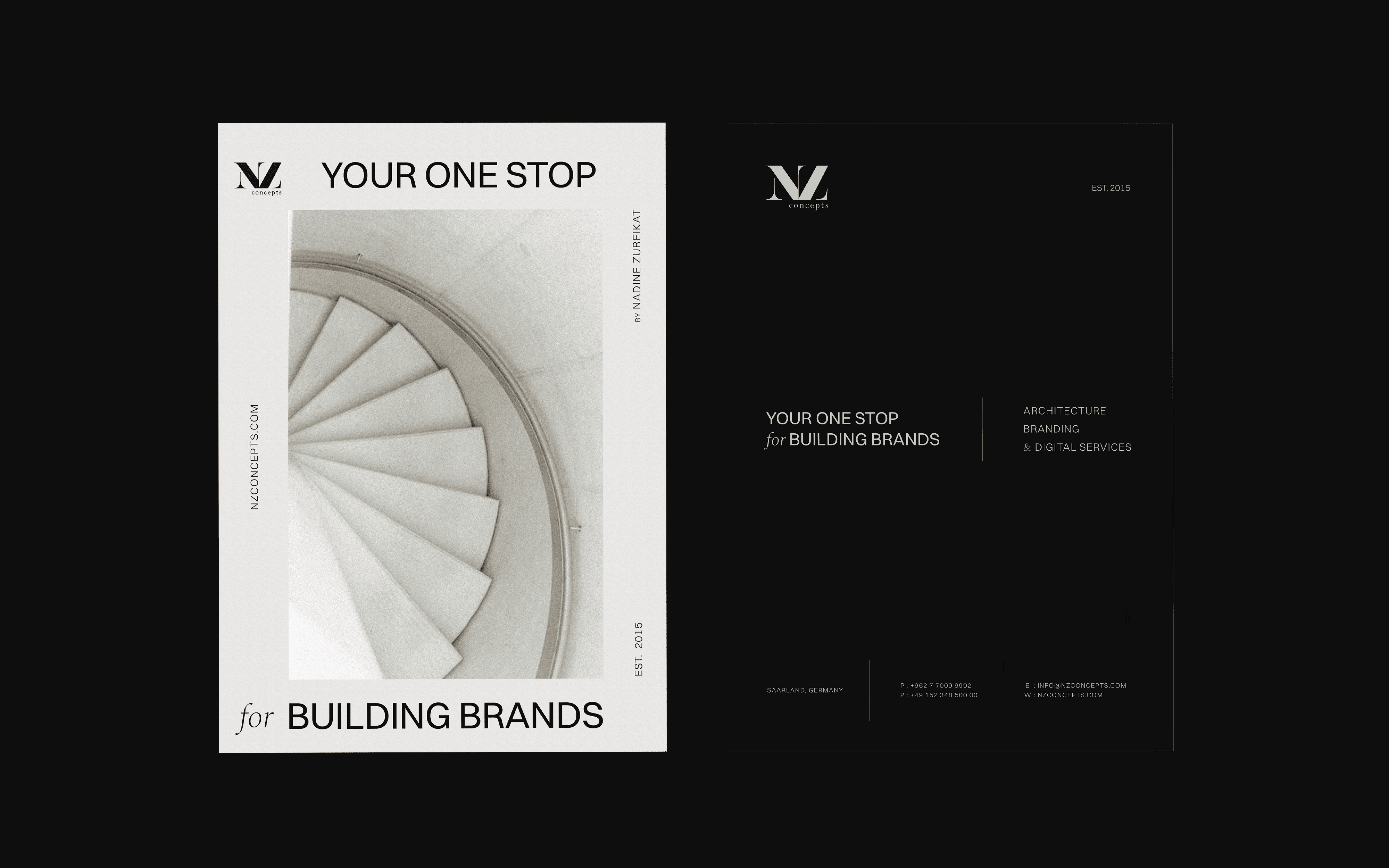
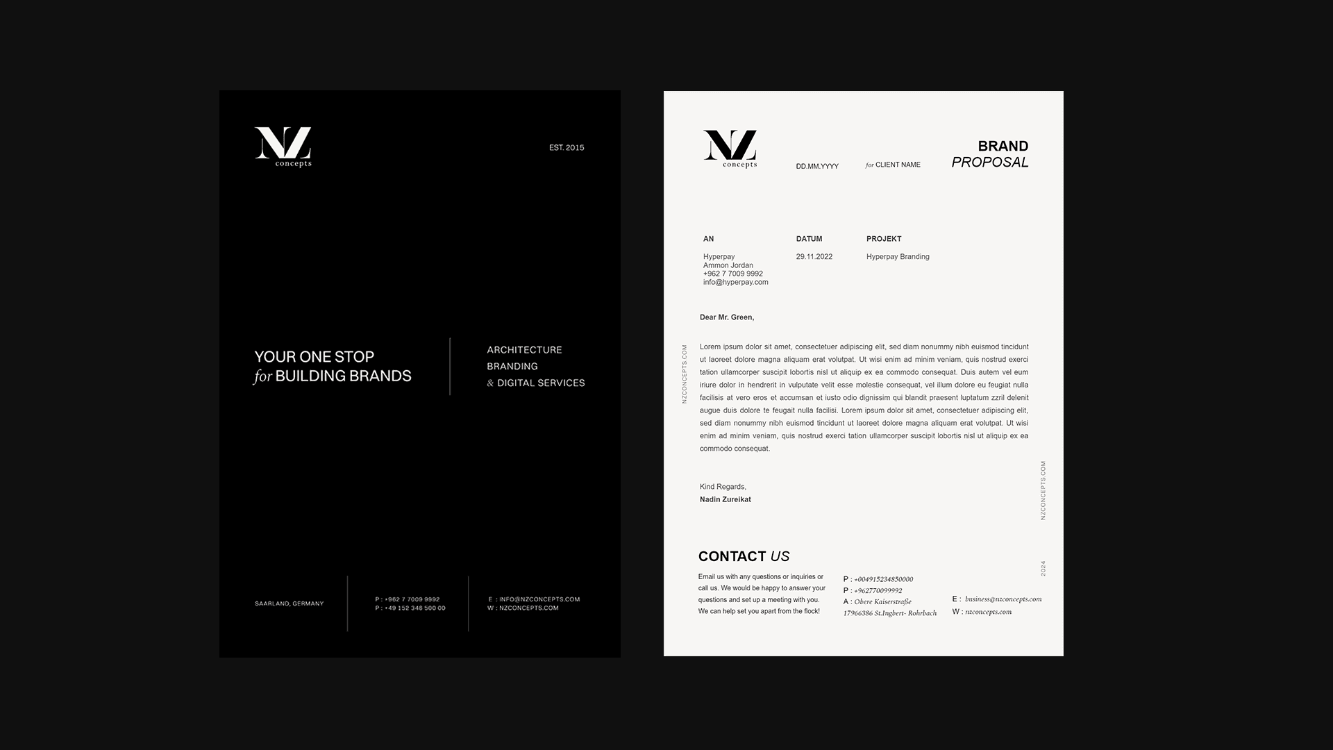
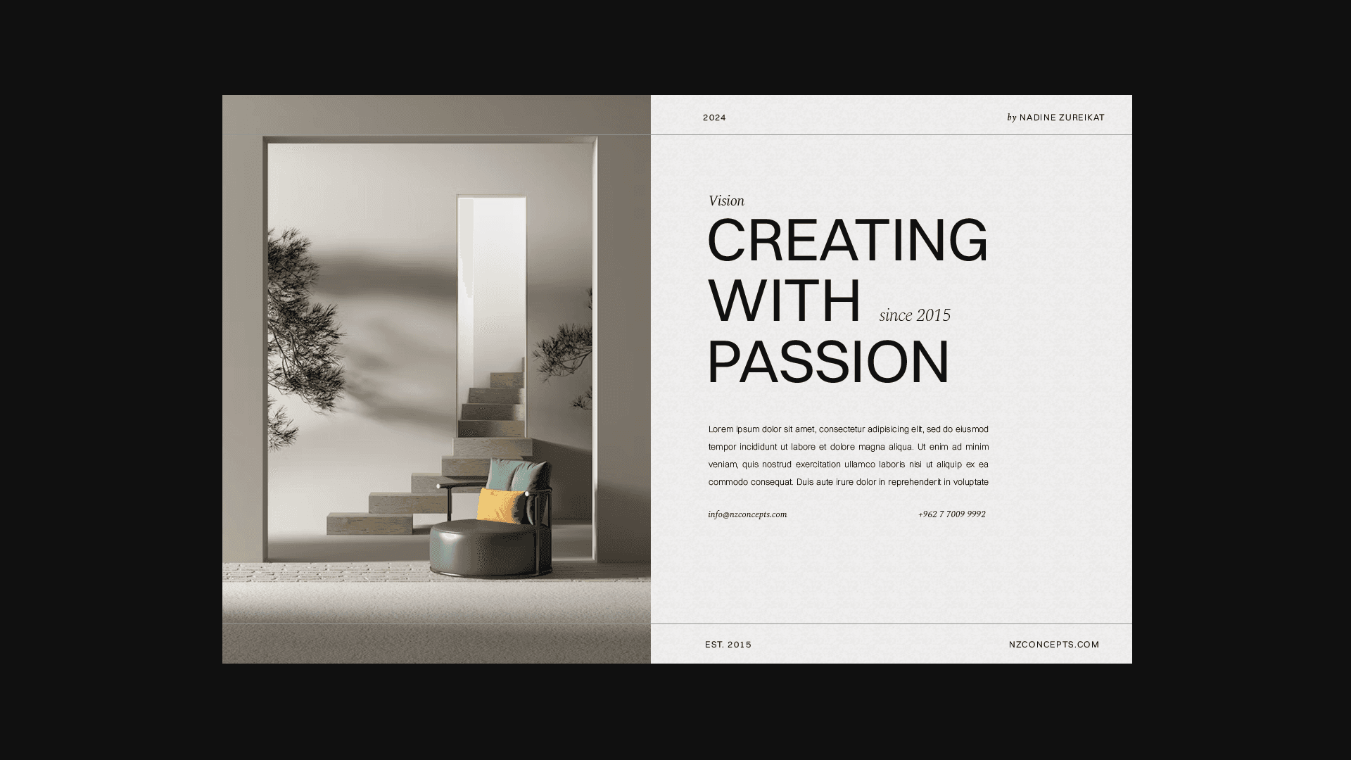
The approved concepts can be viewed below, together with the final Brand Guidelines book.
1. STATIONARY DESIGN CONCEPT
THE PROCESS
Understanding the Brand – After gathering all the necessary info with the client through the discovery call, I started to analyse NZ Concepts' existing branding, industry positioning, and key services in architecture, branding, and digital services in order to provide the redesigns requested by the client.
Defining the Visual Direction – After a deep research about the industry and client's objectives, we collaborated together on a project moodboard to study design trends, common industry design styles and possibilities to bring the modern, bold, and elegant design approach inspired by Swiss-style aesthetics as styles that the client was aiming for her brand.
Typography Selection – Understanding the geometric and minimalist nature of the architecture industry and other key elements defined by the client, I started to select a combination of geometric sans-serif and elegant serif fonts to create contrast and sophistication for her branding, in order to bring the mix of bold, clean and balanced voice and tone as requested by the client.
Color Palette Development – Besides the typography and layouts inspirations collected through our brand moodboard, we also started to define the brand color palette with a refined neutral palette with colours such as white, beige, and black to enhance the brand’s clean and architectural feel.
Stationery & Print Design – With the brand identity defined, I started to design the business cards, letterheads, and promotional materials aligned with the agency’s identity and connects with the main target audiences.
Concept Presentation & Iteration – To guarantee the client's satisfaction and business needs, I developed multiple design variations, refining based on the client's feedback to achieve a cohesive and impactful visual system possible.
Finalization & Brand Guidelines – Finally, after the approval of the brand identity, I started to export all design elements and also document them into a structured brand guidelines book for consistency across future applications.
2. BUSINESS CARDS DESIGN (CHOSEN CONCEPT)
8. BRAND GUIDELINESS BOOK
