Category
Client
Beautibe
Timeframe
4 weeks
THE CHALLENGE
Project Overview: I developed a brand identity for a nutrition supplement brand targeting women who prioritize beauty and a healthier lifestyle. The aim was to create a visually appealing and cohesive brand that resonates with the target audience's aesthetics and values.
The main challenge was to craft a brand identity that seamlessly integrates the concepts of beauty and health while appealing to a diverse demographic of women. The identity needed to be elegant yet approachable, reflecting the brand’s commitment to quality and well-being. Additionally, the brand's visual language had to stand out in a saturated market of health and beauty products.
THE SOLUTION
The resulting brand identity successfully encapsulates the essence of beauty and health, appealing to women who value both. The cohesive and visually appealing design has helped the brand differentiate itself in the competitive market, fostering a strong connection with its target audience and driving brand loyalty.
By blending sophisticated colors and elegant typography, the brand identity not only stands out but also conveys a sense of trust and quality, making it a preferred choice for women seeking beauty and wellness supplements.
THE PROCESS
Research & Strategy – I analysed the target audience, market trends, and competitor brands through a strategy workshop sheet done together with the client to define the brand’s positioning and aesthetic direction.
Concept Development – I explored ways to seamlessly integrate beauty and health through design, focusing on elegance, femininity, and approachability.
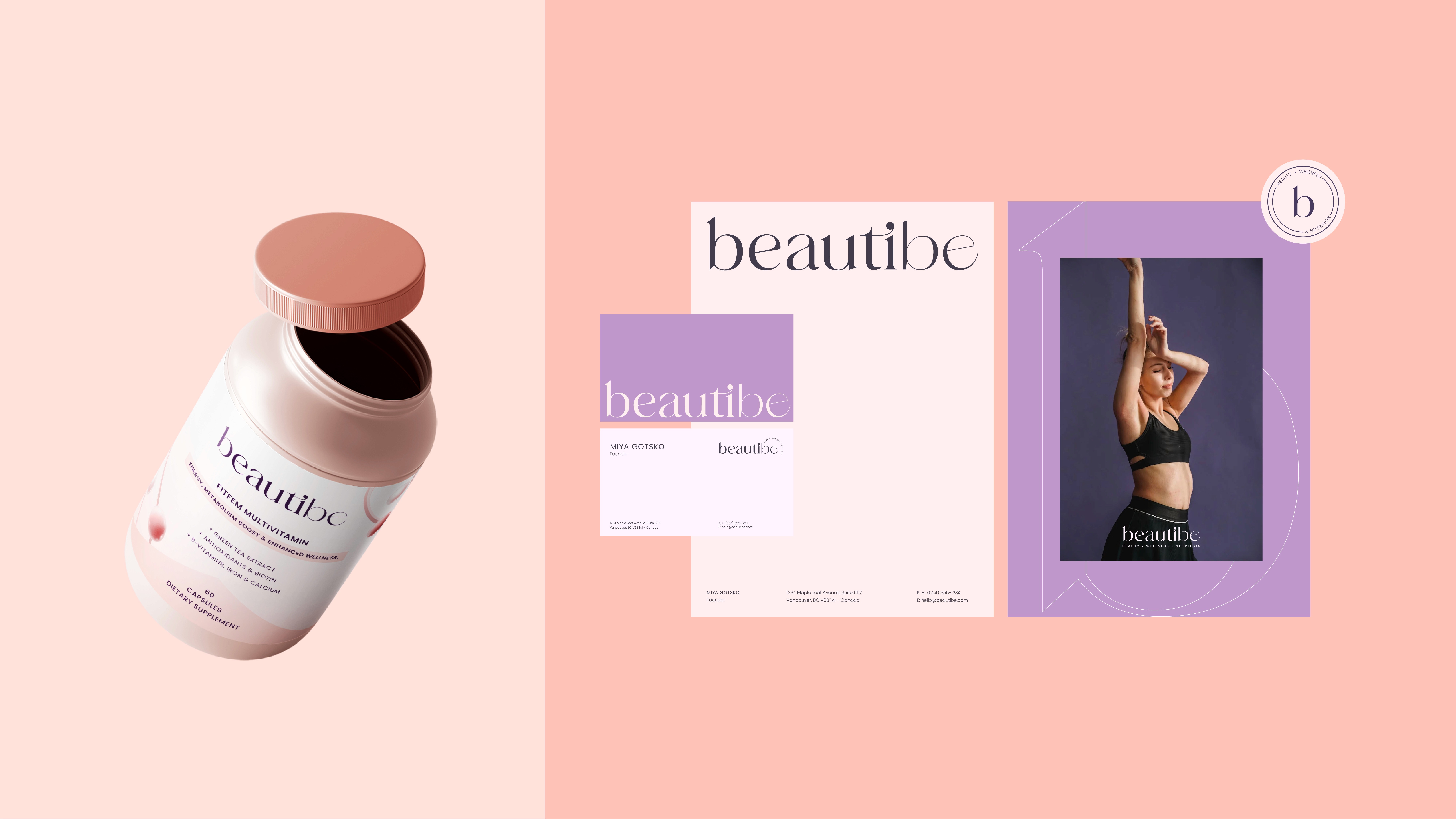
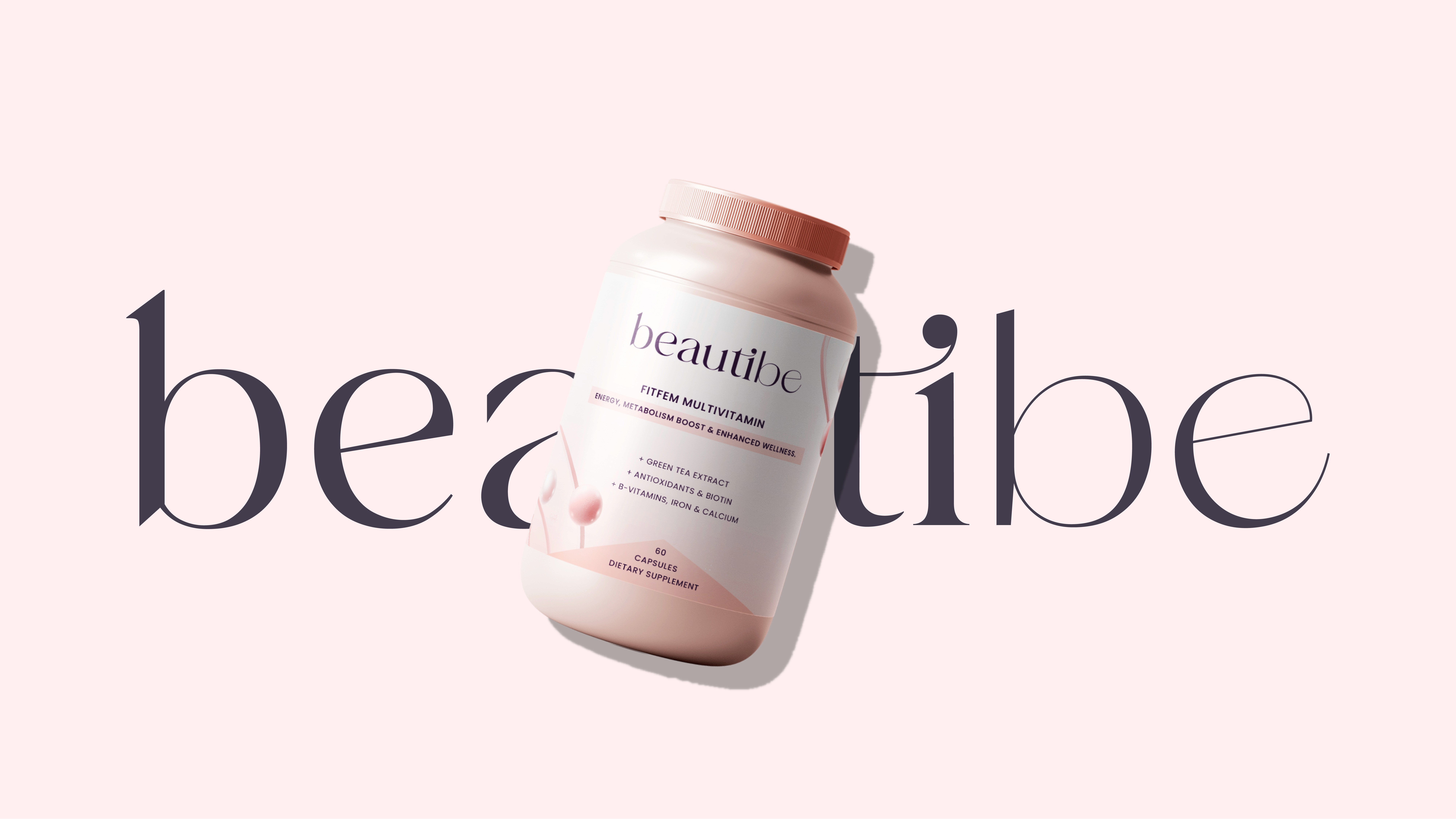
Logo Design – I created a refined and sophisticated logotype that embodies trust, quality, and a modern aesthetic, using of a modern serif font with a dynamic ligature between the letters to give a touch of femininity, elegance and friendliness based on the visual objectives previously requested by the client and in a way that stays legible and adaptable.
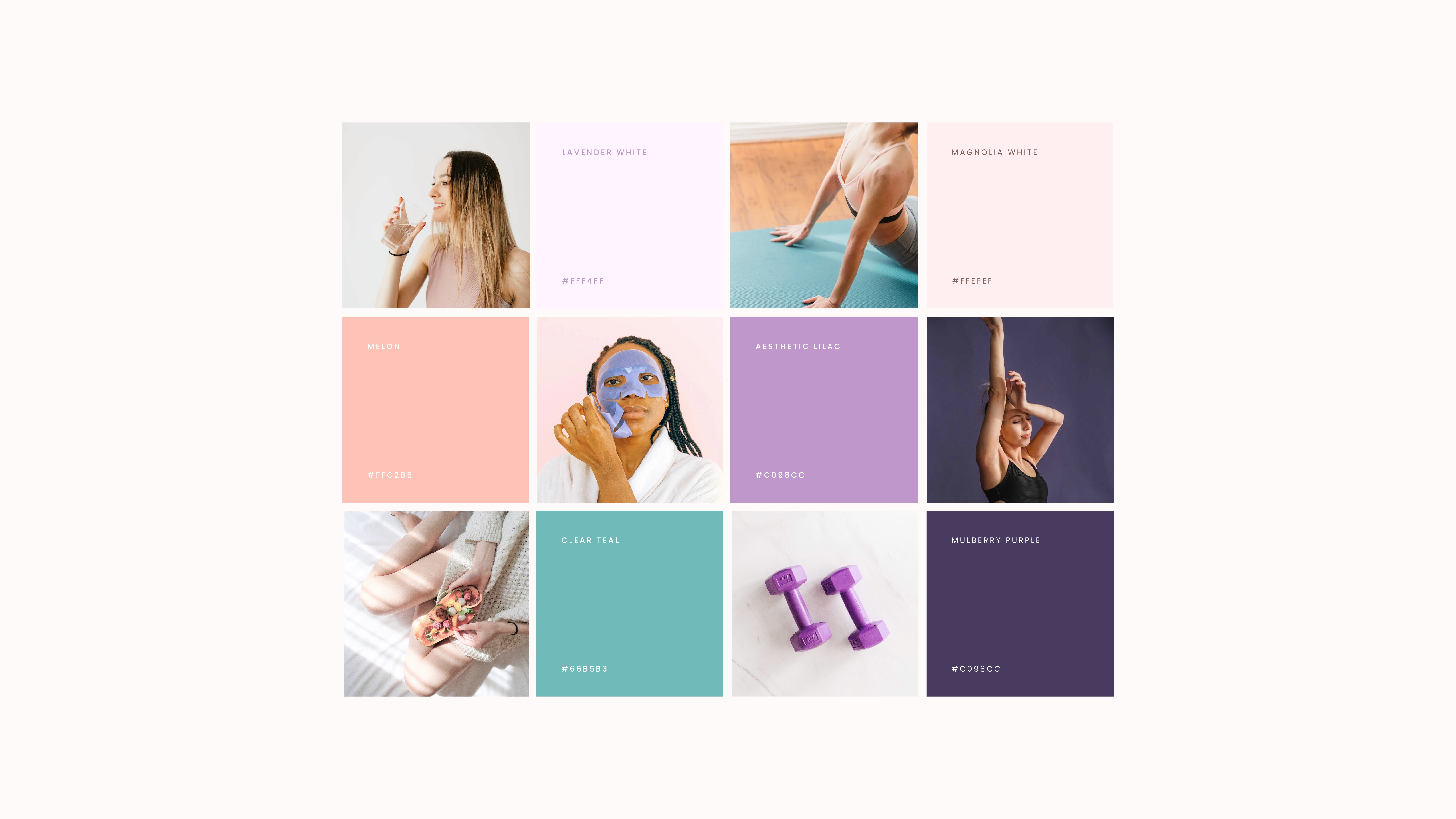
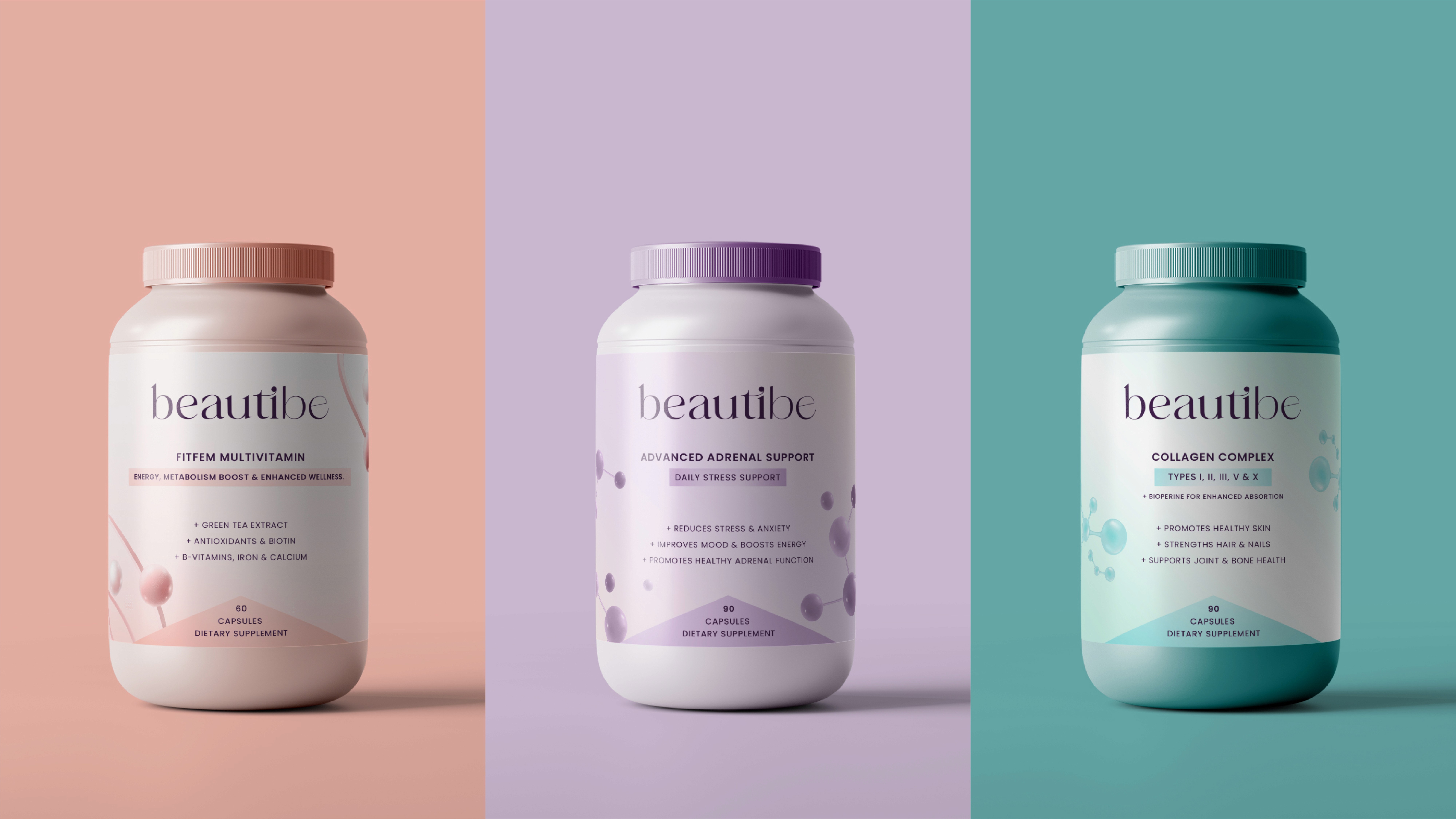
Color Palette Selection – I chose a harmonious blend of soft and sophisticated tones to reflect the beauty, wellness, fresh and feminine vibe the brand was aiming for.
Typography Curation – I paired elegant serif fonts with clean sans-serif typefaces for a balanced, luxurious, yet approachable look.
Visual System & Brand Elements – I developed a cohesive visual identity with supporting graphics, patterns, and iconography that enhance brand recognition.
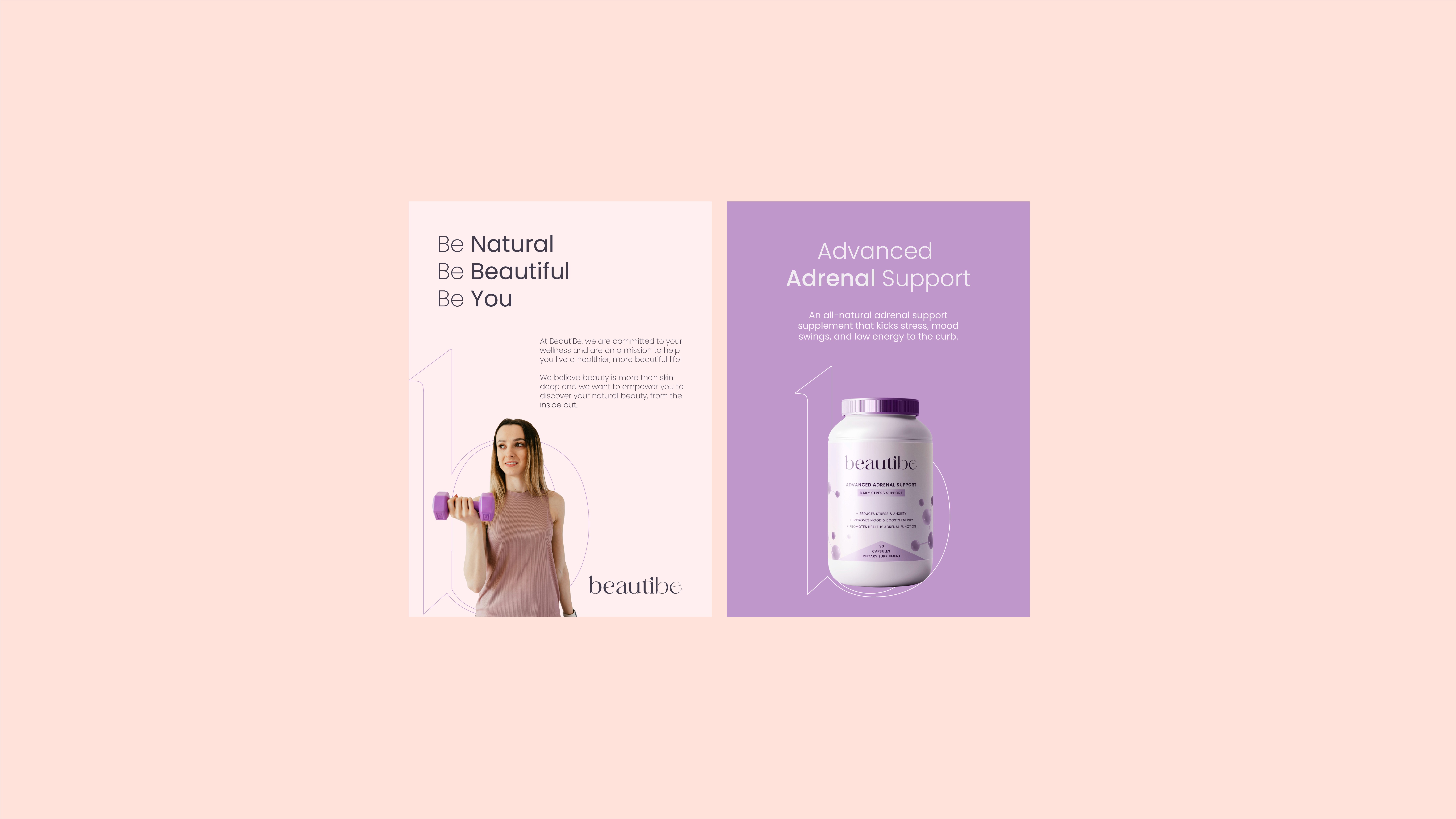
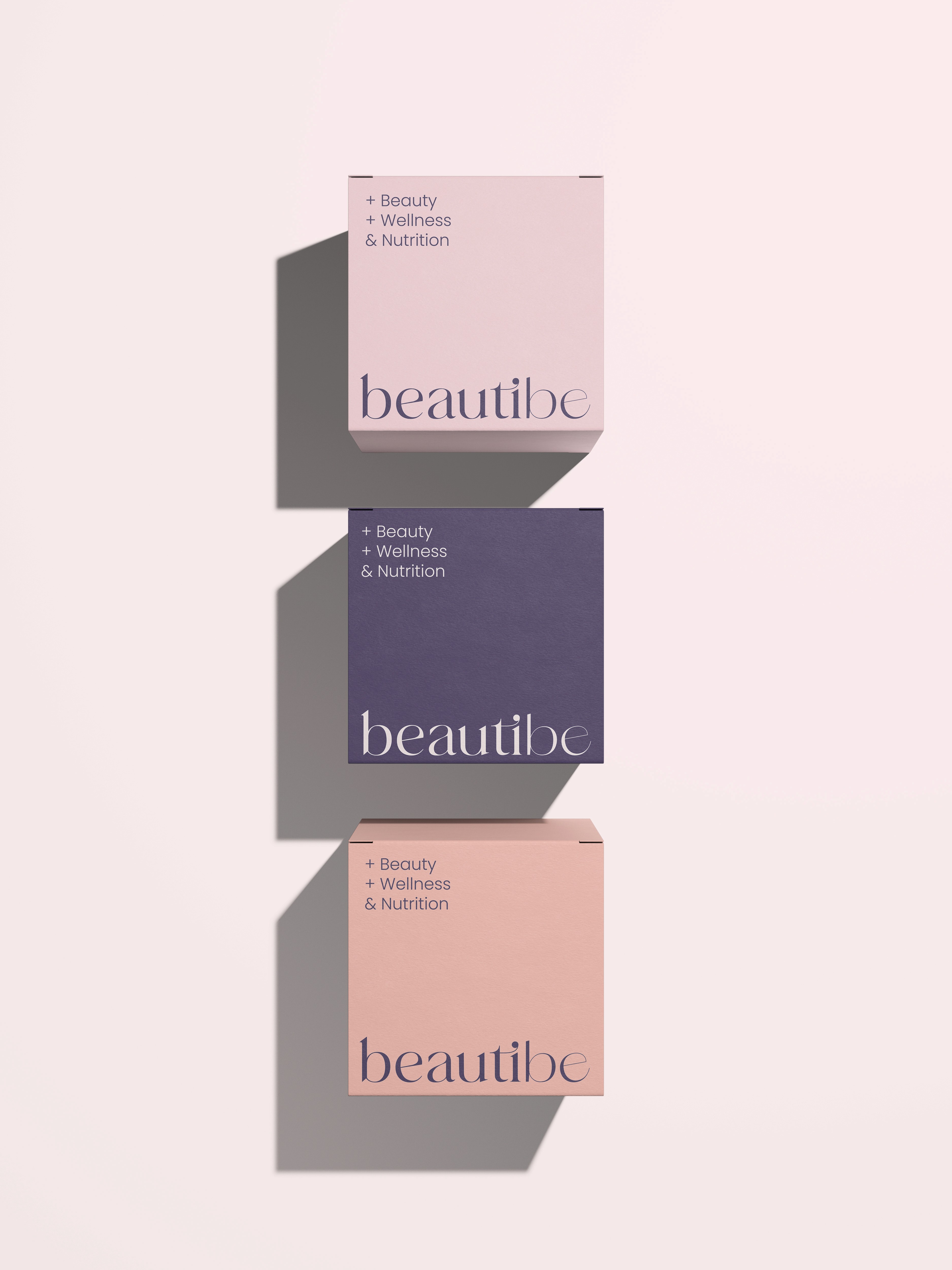
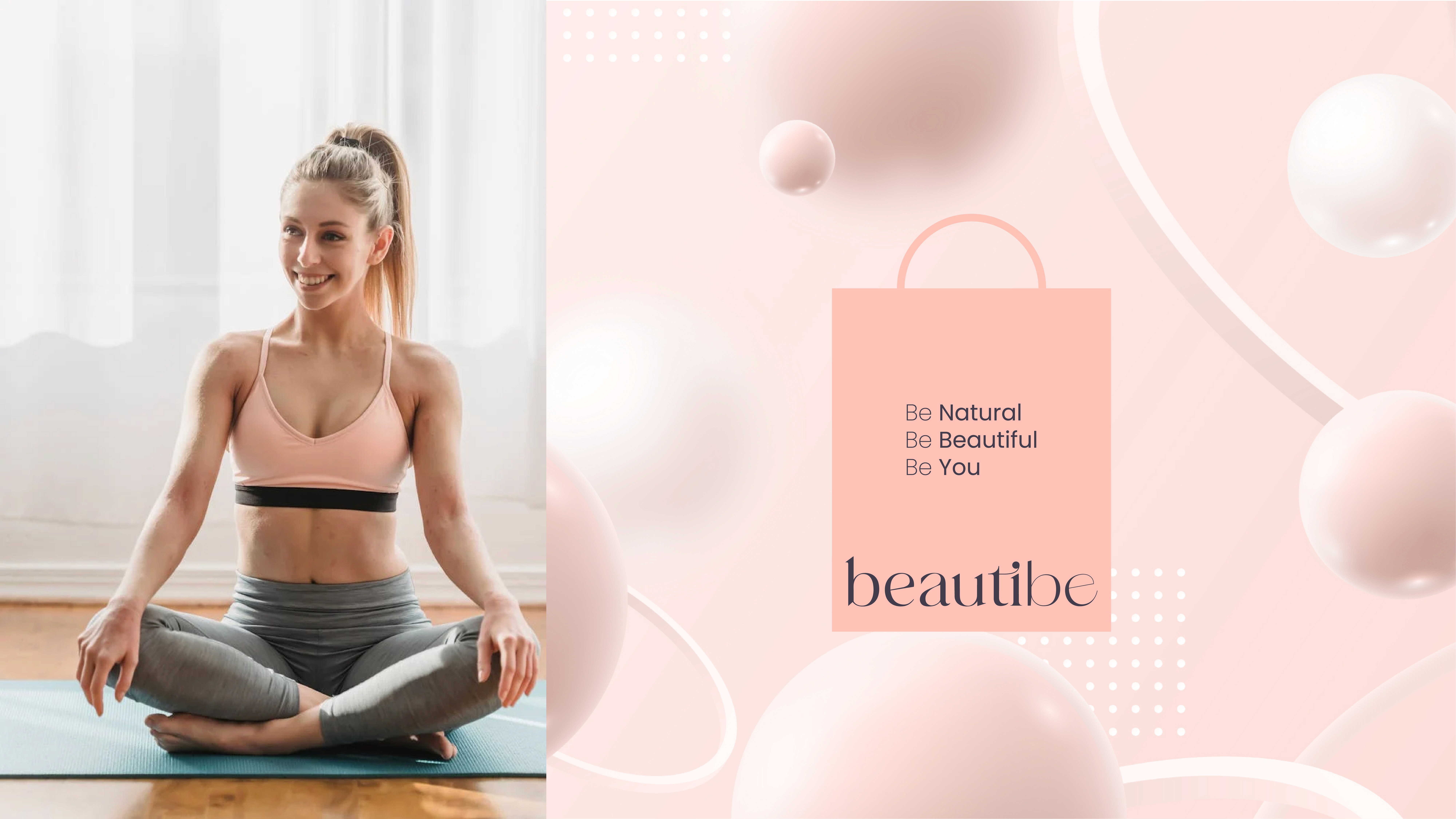
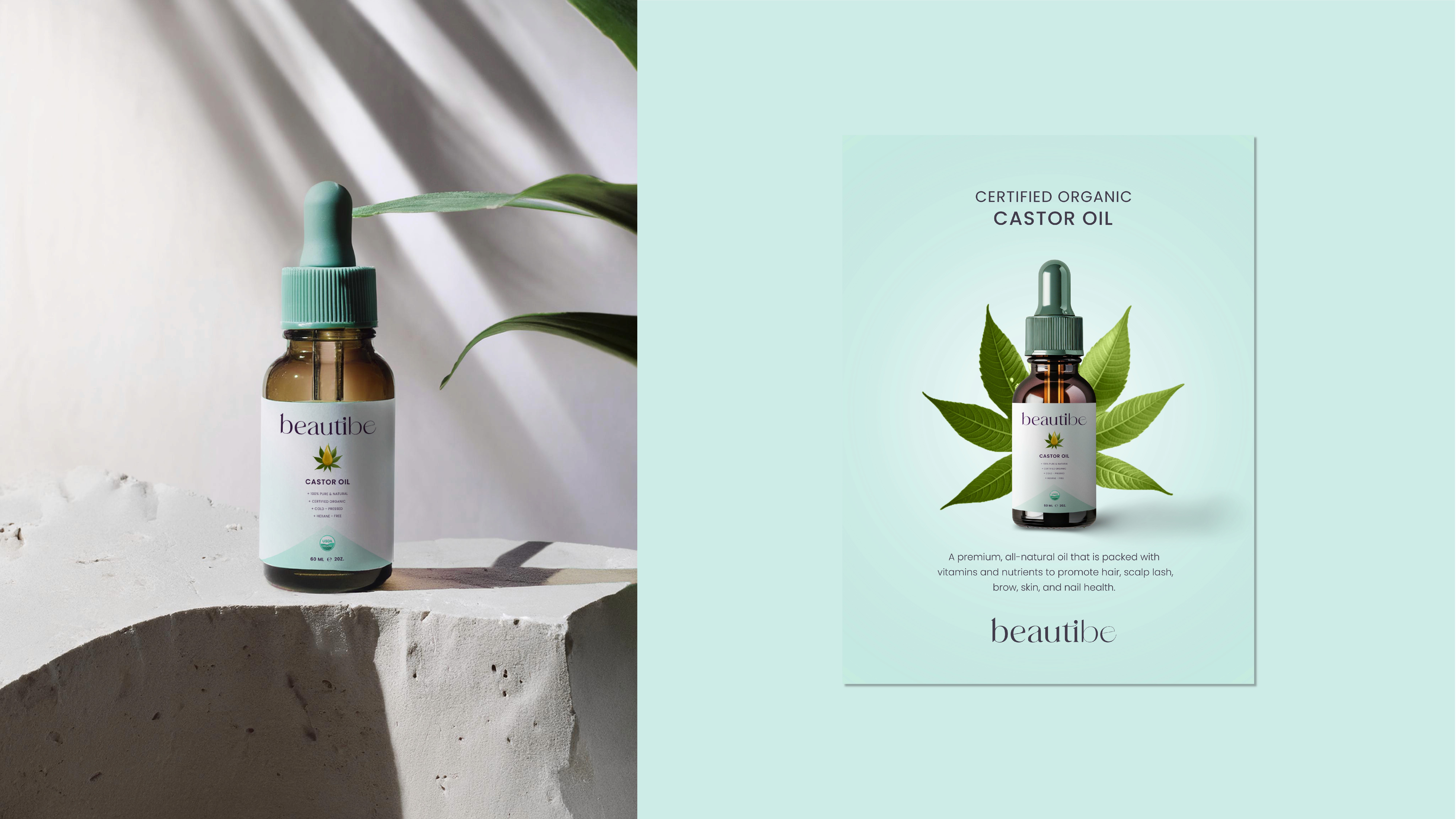
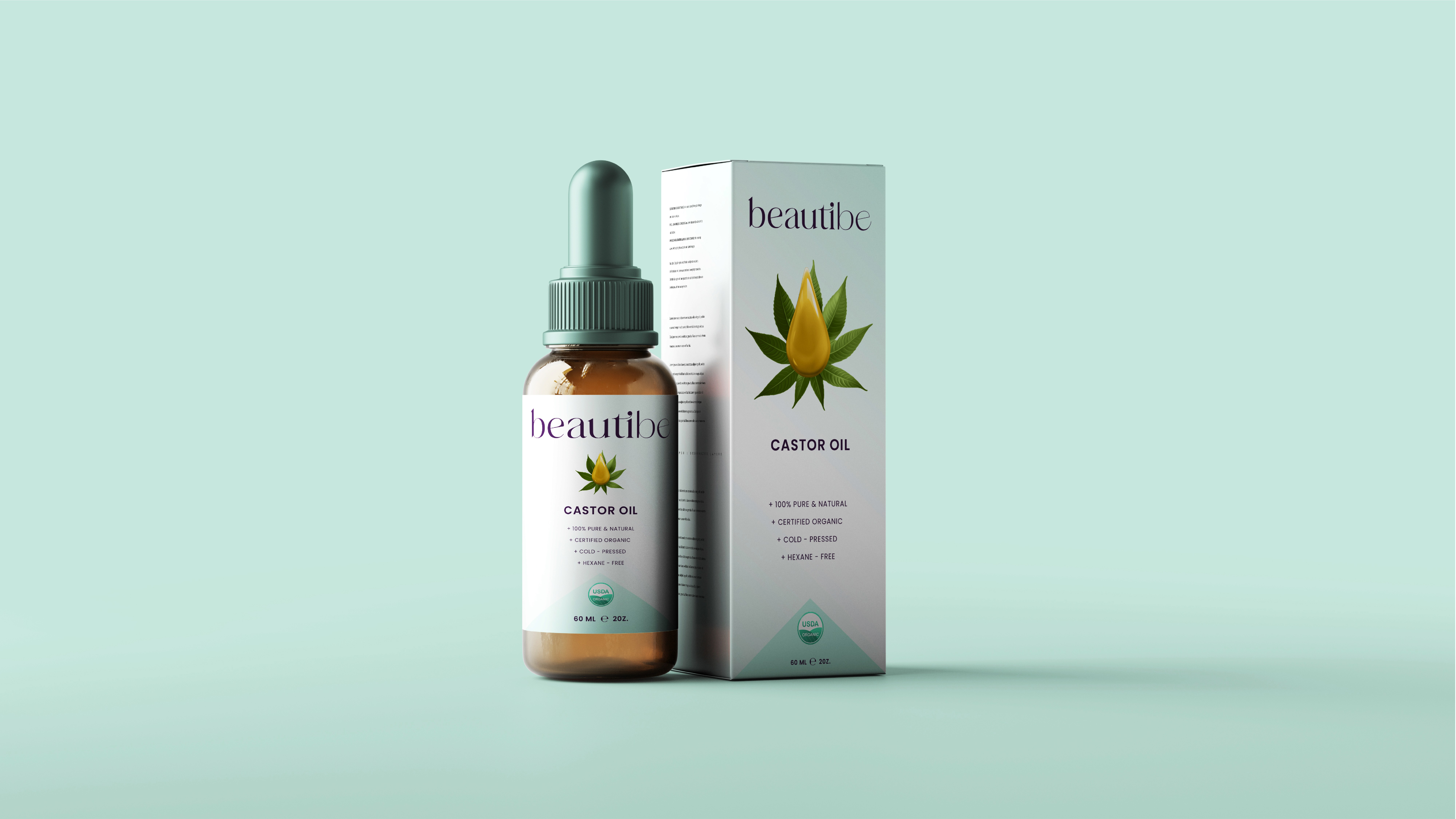
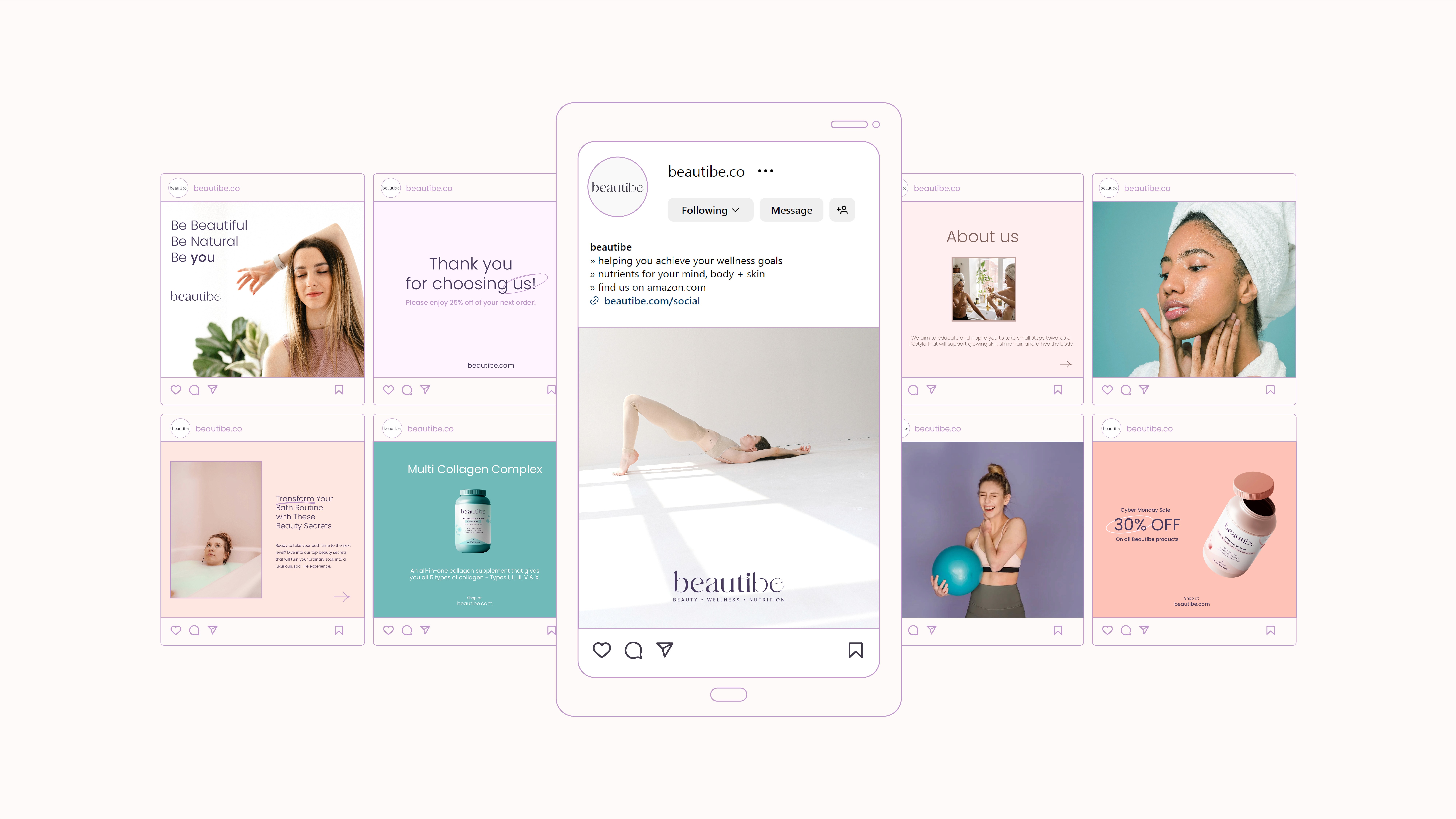
Brand Application – I designed packaging, marketing materials, and social media templates to ensure a consistent brand presence.
Final Refinements & Delivery – Finally, I polished the brand identity, ensuring all elements align with the brand’s vision and stand out in the competitive market.
1. BRAND STRATEGY WORKSHOP
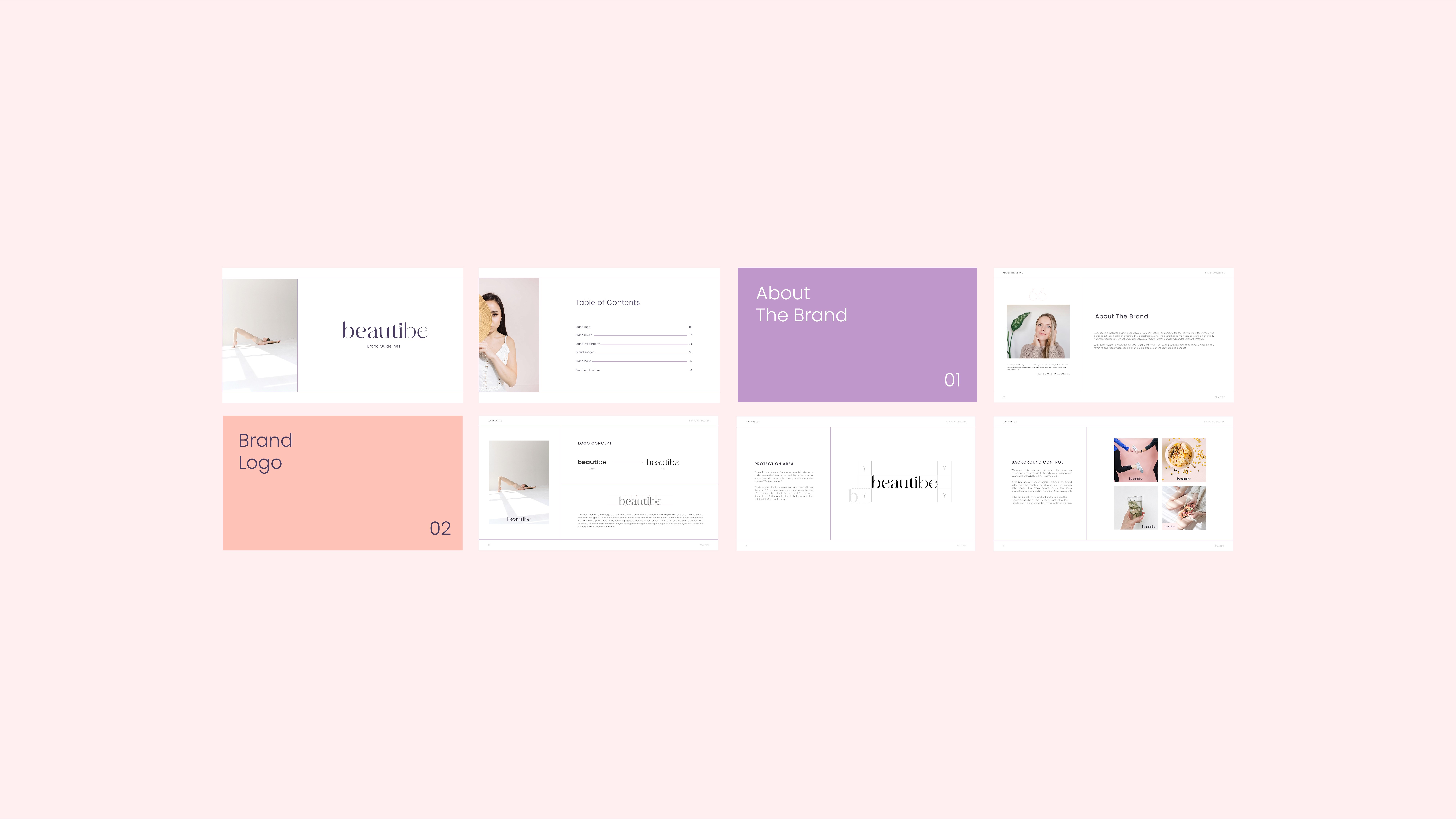
2. BRAND GUIDELINES BOOK
3. PRINT & DIGITAL COLLATERAL DESIGN
